Safety First
Helping you stay safe during an earthquake.
Safety First is a software that guides users through how to prepare for the large earthquake that has been predicted to happen on the BC coast.
Platform
Mobile
Duration
4 Weeks
Team
Individual
Role
UI Designer
Software Used
Problem
According to a report released on April 5th, 2023, by Volcano Discovery, British Columbia experienced 30,181 quakes above magnitude 1.0 in the past 365 days. That said, the province’s population doesn’t know how to prepare for those earthquakes and lacks platforms to assist them during these natural disasters. The current existing ones only provide users with alerts, not addressing their pains and needs.
Solution
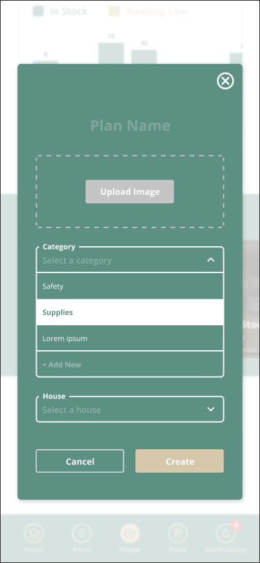
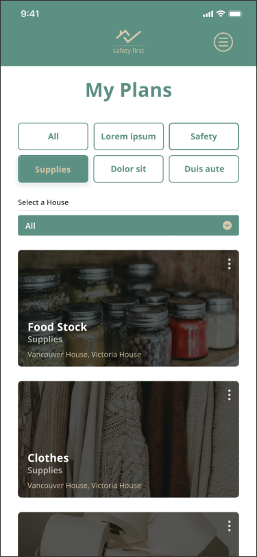
Safety First is a software that guides users through how to prepare for the large earthquake that has been predicted to happen on the BC coast. Households can set tasks and create plans to keep their houses safe during emergencies.
Main Features
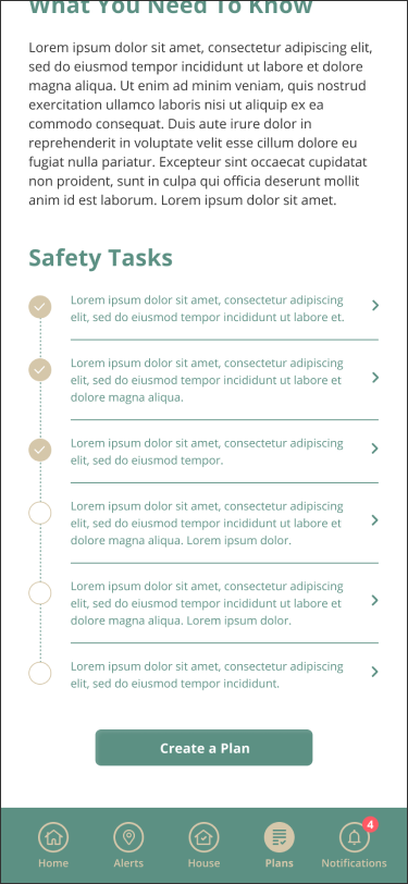
Create Emergency Plans
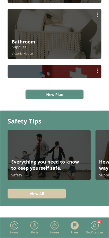
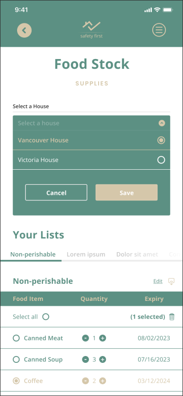
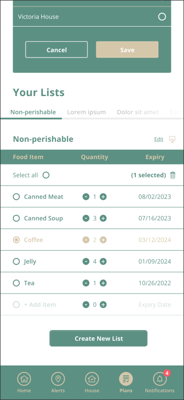
Be prepared for an earthquake and plan supplies stock and safety procedures.
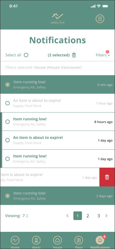
Receive Alerts and Notifications
Receive earthquake alerts all over BC, as well as stock and plans notifications.
Communicate With Households
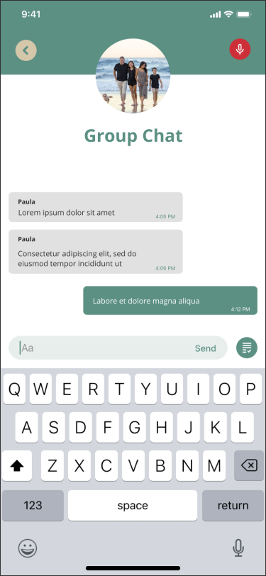
Communicate with households through a chat and send alerts during emergencies.
Mockups
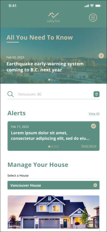
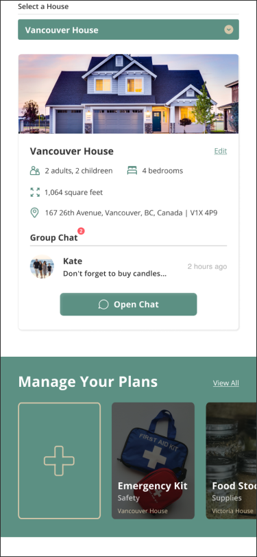
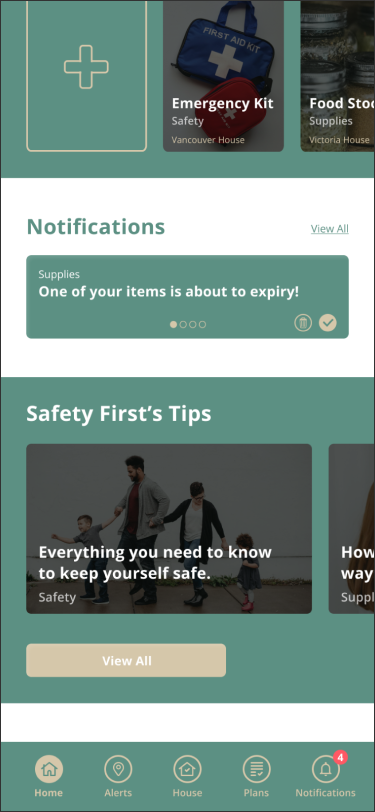
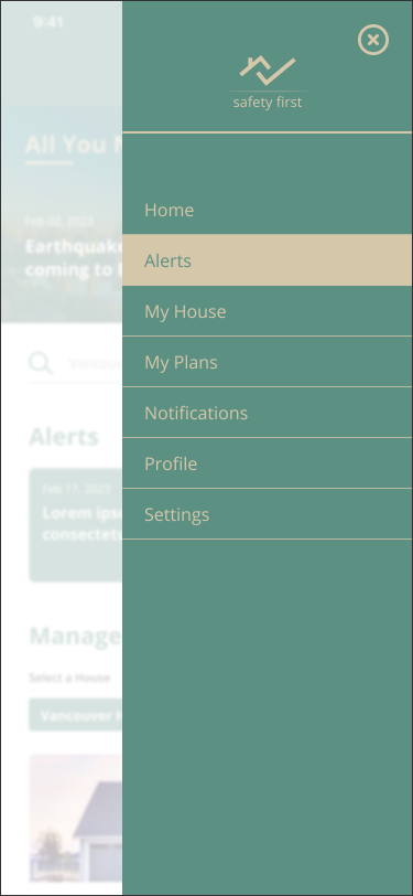
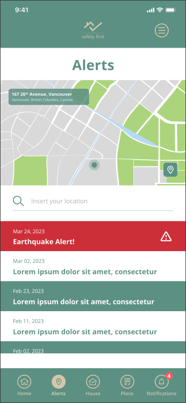
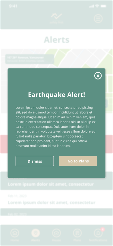
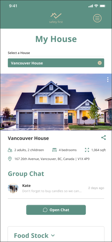
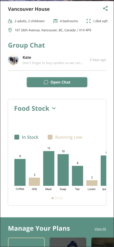
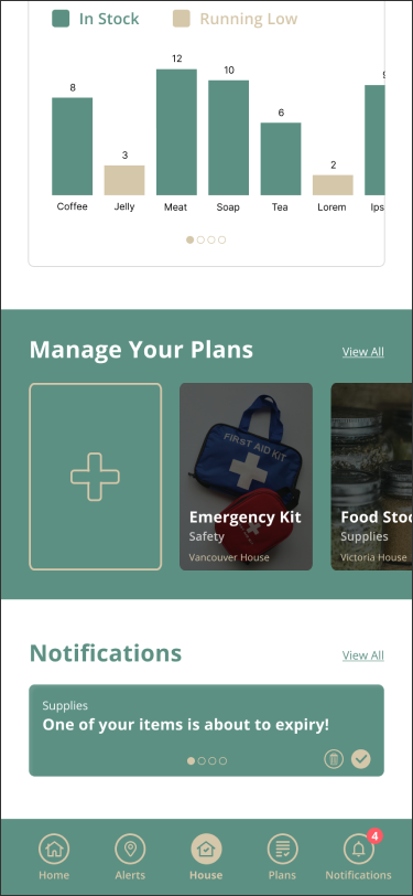
Design Process
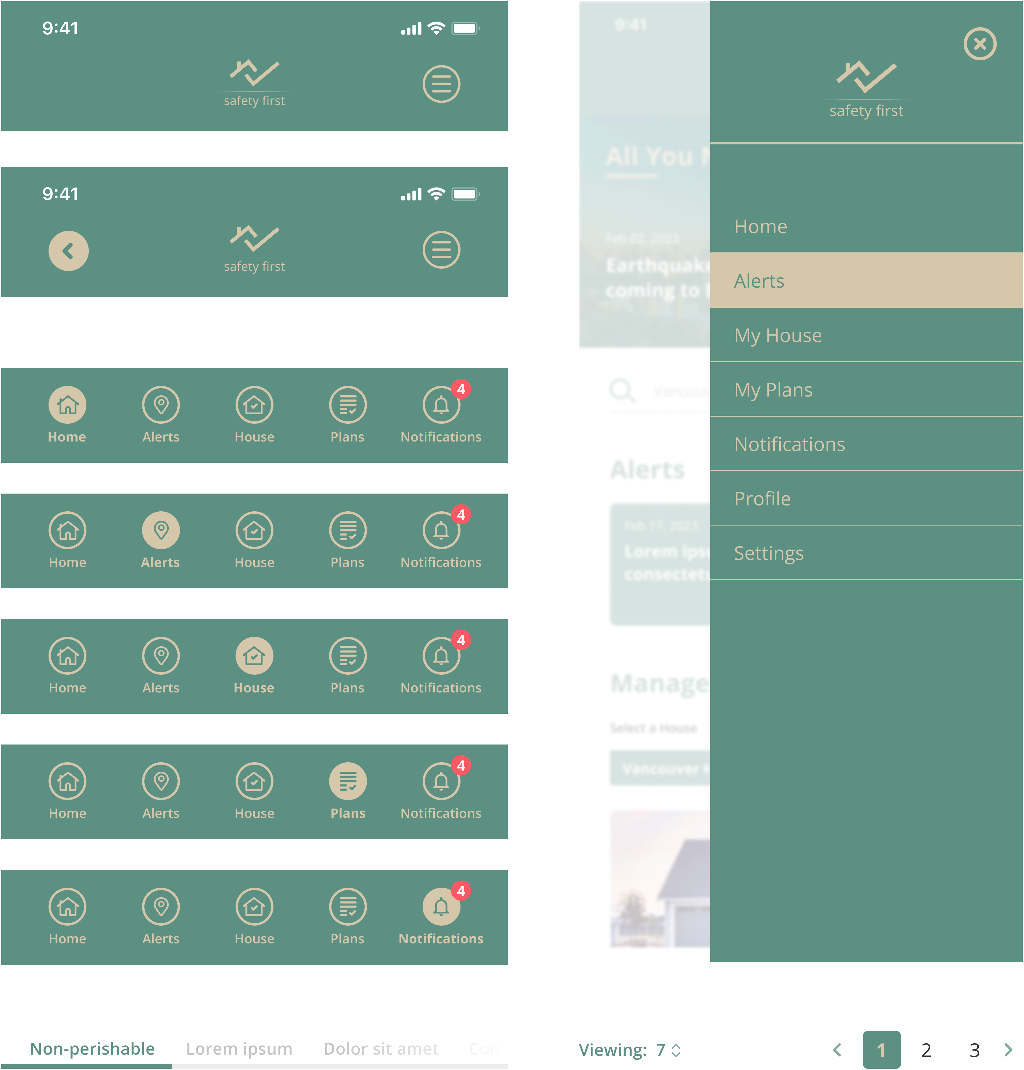
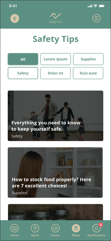
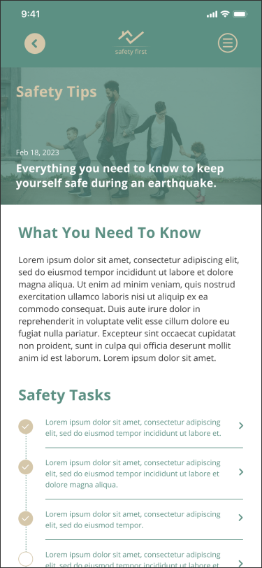
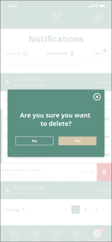
The Safety First application was designed to make users feel safer and calmer than they usually would during a tremor event. As opposed to relating to earthquake disasters, the design aims to evoke protectviness feelings. That said, the images used throughout the platform focus on families, and the layout utilizes icons and fields with thin strokes to bring a fresh, modern and clean look to the app.
Logo

Logo Explanation
Considering the centrepiece of the application is helping users stay safe and prepared during an earthquake by allowing them to plan ahead of time, the logo utilizes a house icon with a check mark to evoke the idea of tasks being completed to keep the house secure.
Typography
Open Sans
Typeface
Open Sans is a clean and modern sans-serif typeface with large letter width and spacing, which accounts for good legibility and readability. This font was chosen to match the friendly and fresh look of the application.
Font Family

Font Size & Weight
| Scale | Weight | Mobile Size |
|---|---|---|
| Heading 1 | Bold | 36pt |
| Heading 2 | Bold | 24pt |
| Heading 3 | Bold | 18pt |
| Body 1 | Regular | 14pt |
| Body 2 | Regular | 12pt |
| Button | Bold | 14pt |
| Label | Bold | 12pt |
| Placeholder | Regular | 14pt |
Colour Pallete
#5C9083
#D5C7AA
#F6EEDB
#C4C4C4
Colour Explanation
The colour palette explores earth tones to connect with nature and associate with earthquakes. In addition to offering great contrast to the layout, green and beige helps the application differentiates from its competitors. Finally, green also delivers a more positive tone to the design – as opposed to red, which is one of the main colors used by the competition.
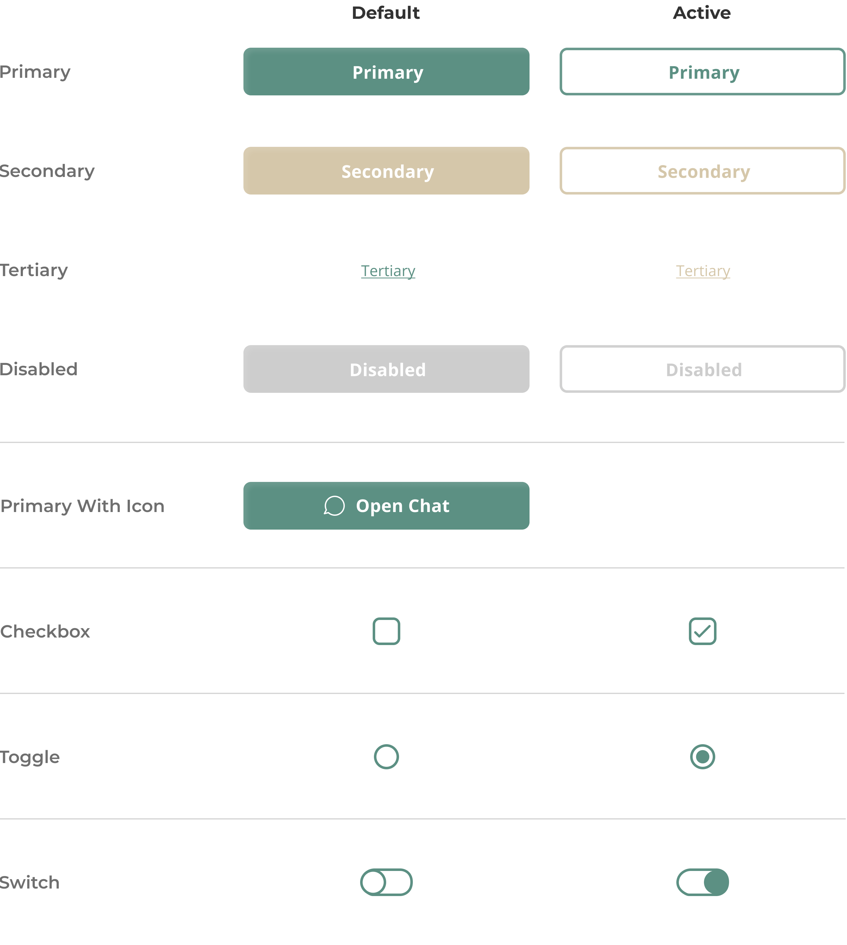
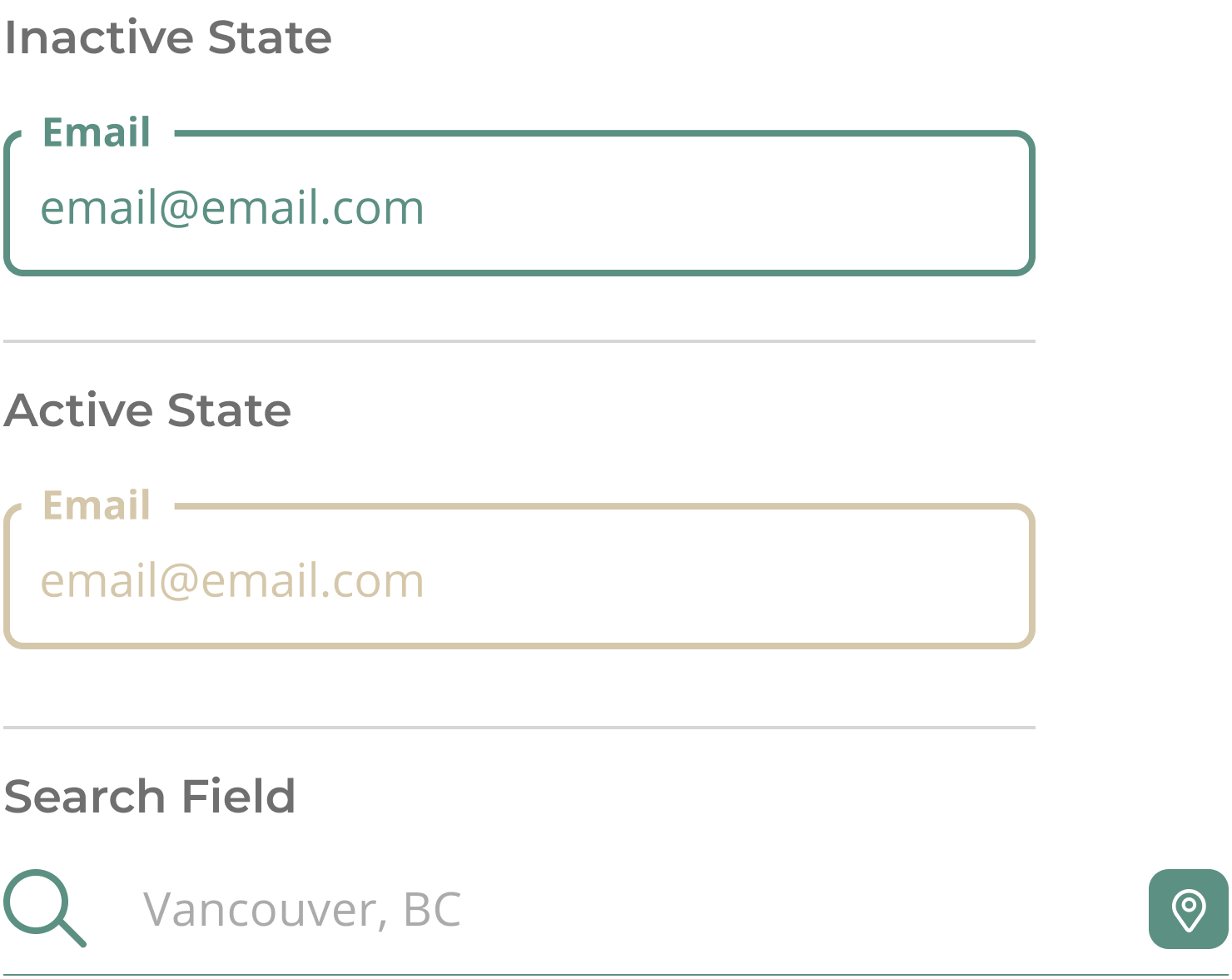
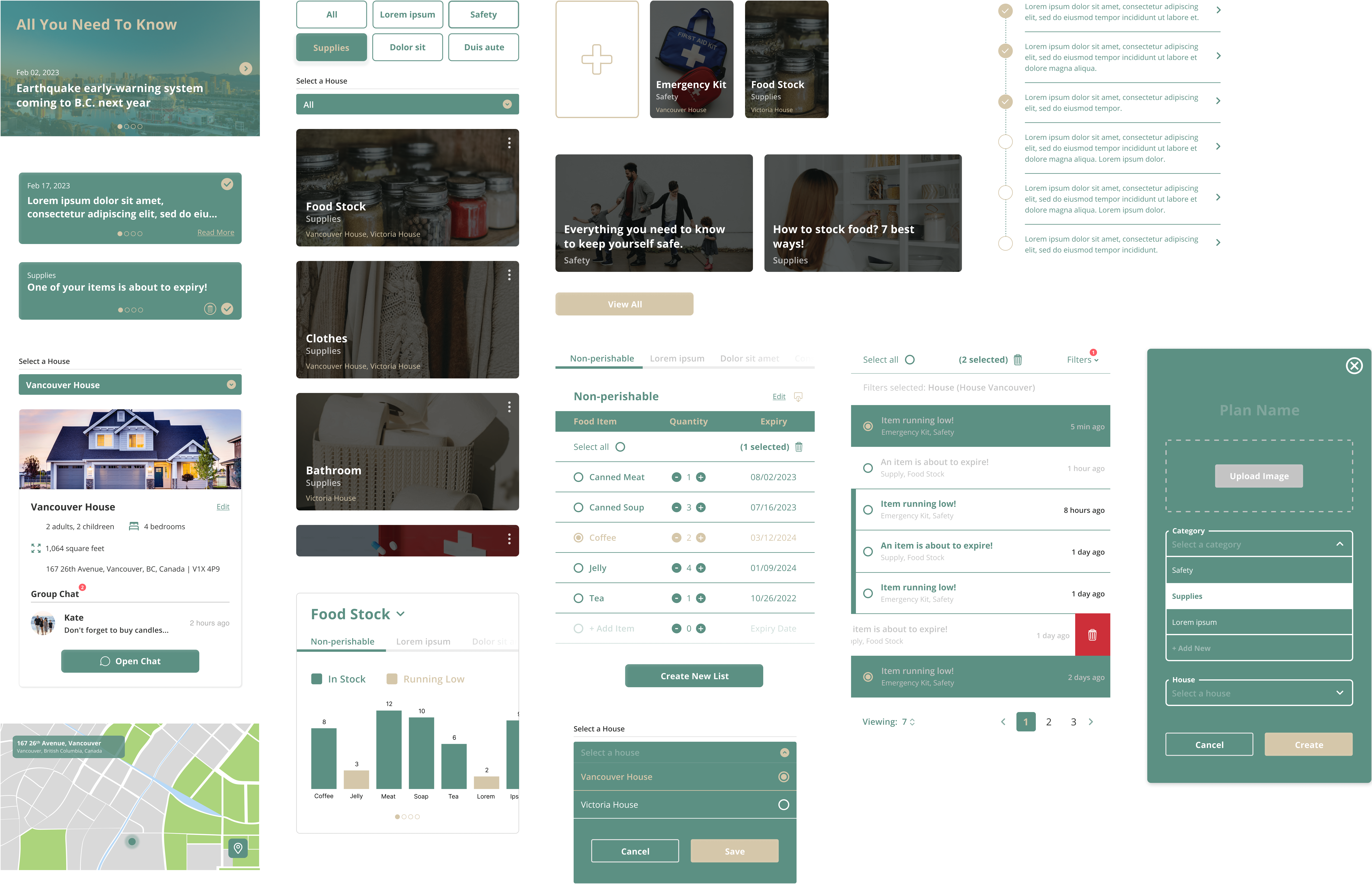
UI Components
Cards
Contact Us
Please leave us a message and we will get back to you as soon as possible.
